2014 International Equity Strength Map (Or The Lack Thereof)
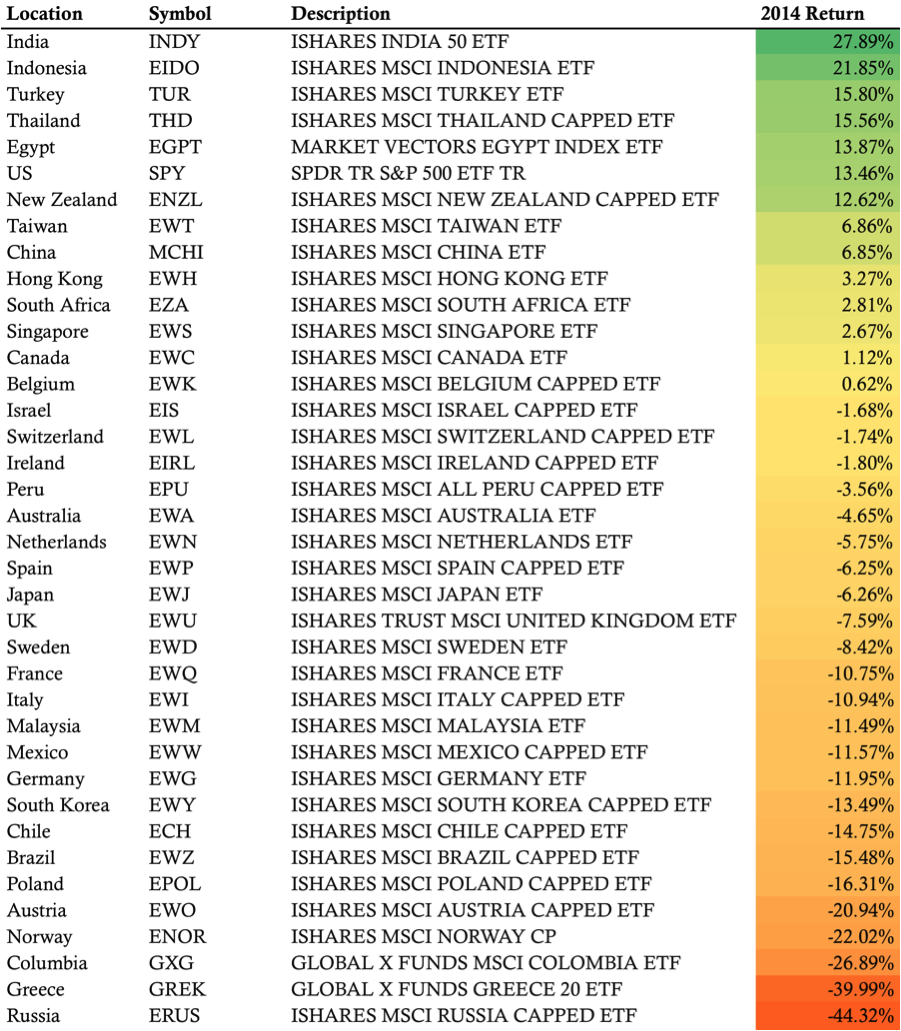
U.S. Stocks finished higher again in 2014 and that strength could potentially lead us to believe that risk assets performed well in 2014. However, a look around the world at our neighbors suggests that all risk assets aren’t created equal. As many people know, 2014 wasn’t kind to Russian or Greek equities, however, the majority of International Equity markets ended the year in negative territory.
In the map below, we’re taking a look at some of the major Equity markets around the world. All of the International Equity markets shown have an ETF available and the returns shown below are the ETF returns. Performance is measured based on 2014 total returns, including dividends, with data coming from Yahoo Finance. A table view of the markets follows the map.
Please share this post if you enjoy the map.
Also check out this post: 5 Investing Lessons from the Russian Crisis
2014 International Equity ETF’s – Total Return Performance Map
2014 International Equity ETF Performance

If you enjoyed this post, please click above to share it on Facebook or Tweet it out. Thanks for reading!
Want to receive a notice when the map gets updated?
Sign up for my email list and stay up to date with the latest information on Trend Following and ETF Momentum Trends.
Click here to sign up for the list, get a copy of the Theta Trend Options Trading System, the Trade Tacker I use, and information about new systems.
Even better . . . it’s all totally free.
